Creative writing: Draft 1
I am fascinated by the meeting of analogue and digital through animation. It usually leads to unexpected outcomes that deliver more human messages. In this vein, I have always wanted to try riso animation, a technique originated from the combination of risograph printing and animation. Riso printing by itself is special for its vibrant soy inks, its grain touch caused by the imprecise overlapping of its layers, and finally its ability as a stencil duplicator to print large quantities at a very fast pace. How to honor and benefit from those properties through animation? Will the colors be as limpid? Will movement alter the grain? Will the process be facilitated by the productivity specific to riso printers?
And vice versa, an animation is characterized by its dynamism, fluidity, rhythm, duration… How will the imprecision that defines riso-printing affect the smoothness of animation? Will there be temporal, financial, ecological limits of the animation of a medium like riso printing? For instance, before printing final copies, it seems that the ink must be applied evenly on the stencils. Will there be a lot of waste of paper in the process?
Overall, how do those two disciplines can coexist? Which aspects can I be in control of? Which ones can I not?

Creative writing: DRAFT 2
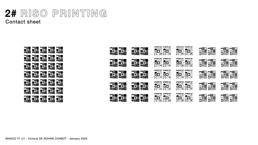
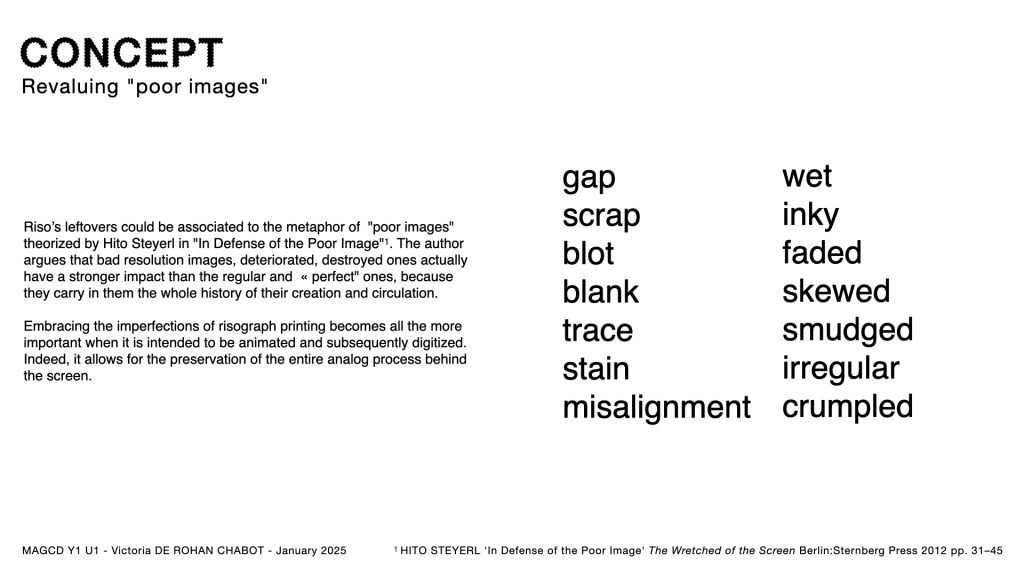
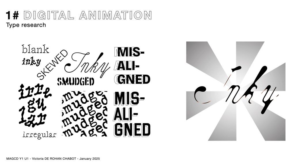
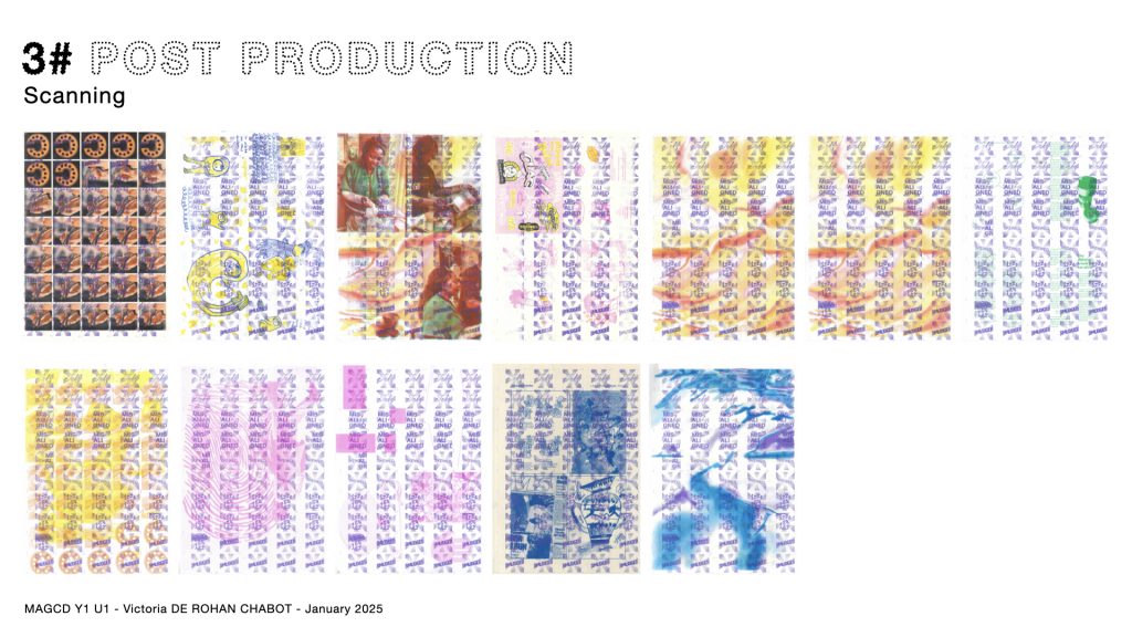
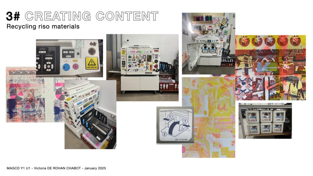
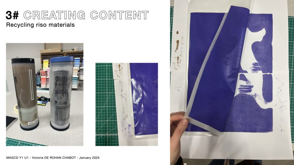
Misalignments, skewed images, smudges, irregularities… so many reasons to hit the green print button of a risograph printer once again. Sometimes, this action must be repeated over and over before achieving the “perfect” print. As I familiarized myself with the many strengths of the risograph printer—vibrant colors, texture, fast and cost-effective printing in large quantities—I also became aware of its flaws.
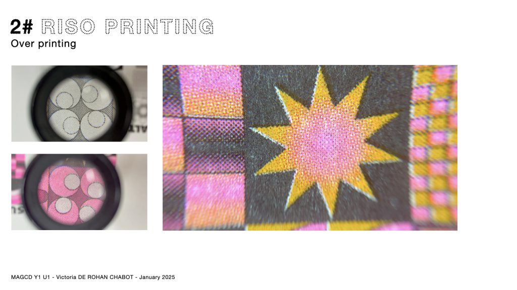
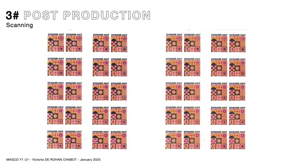
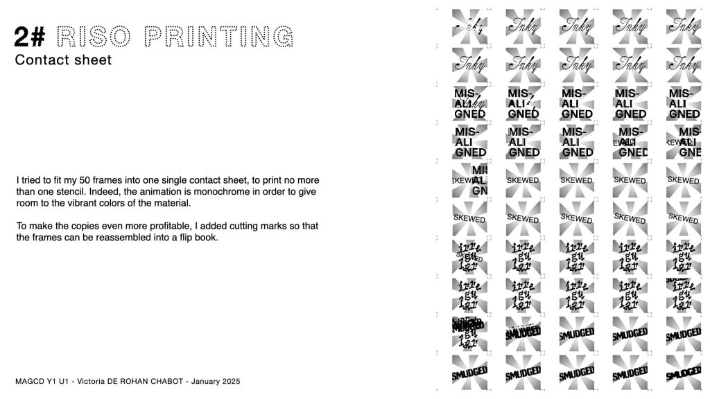
This printer has the particularity of printing color by color, but achieving perfect alignment is rare, and one must often embrace the inevitable margin of error in this process, which frequently results in white gaps. Moreover, the ink used in risograph takes a long time to dry and always remains slightly wet, leading to smudges and stains. What frustrated me the most, as a motion design enthusiast, was realizing that when this so-called “duplicative” printer is used for animation, its main advantage becomes obsolete. Animators using a risograph printer end up printing far more copies than the single contact sheet they actually need. Only one copy of each frame will be kept for the animation, while the others are relegated to the status of scrap paper or test sheets for future prints. But the waste is not just material, financial, or ecological—it is also aesthetic!
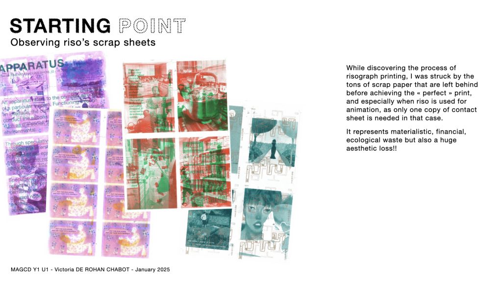
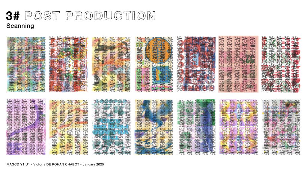
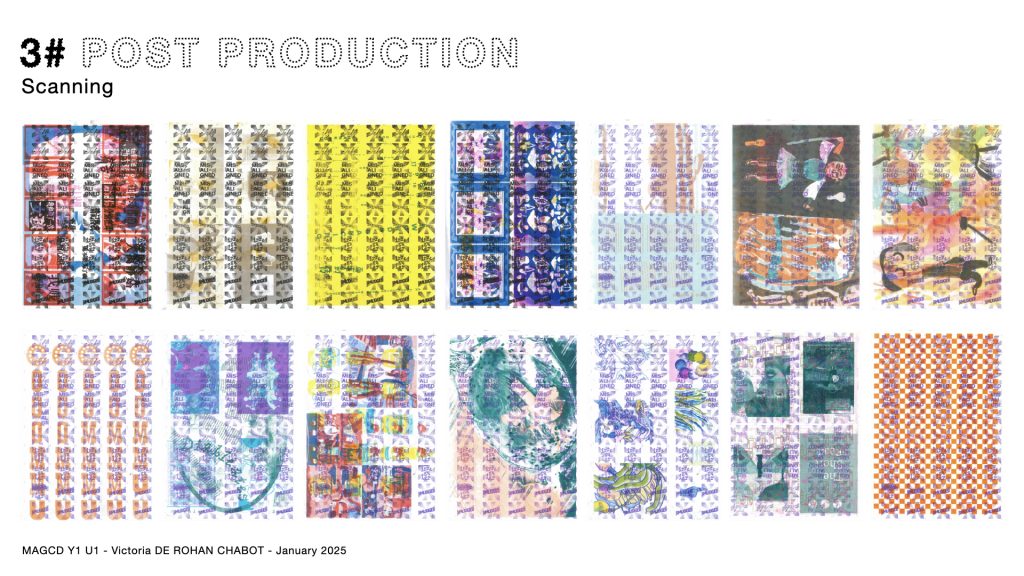
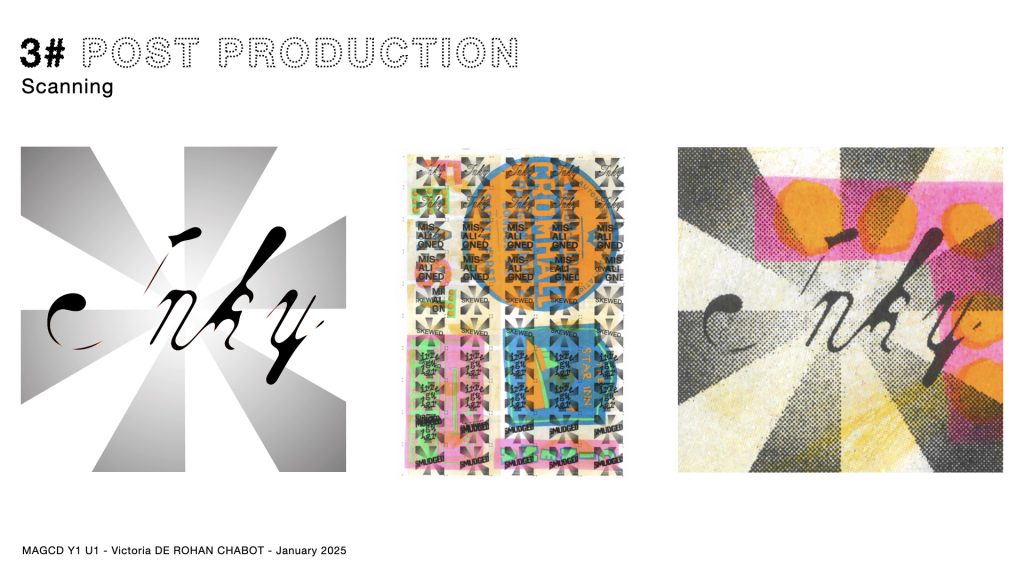
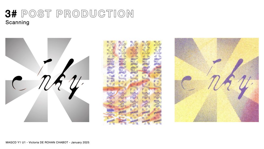
While rummaging through the draft sheets piled next to the risograph printers at CSM, I was struck by the visual and informational richness left discarded. Multiple layers from different designs randomly overlap, some colors are emphasized by the presence of others… In “In Defense of the Poor Image,”* Hito Steyerl revalues “poor images”—those that are poorly reproduced, degraded, or low-quality. According to her, these images hold a greater power and significance than “perfect” ones because they carry the history of their creation process. While Steyerl primarily refers to digital images, her insights also resonate with risograph scrap sheets in addressing the hierarchy between high-quality prints and imperfect ones that end up as waste.
Therefore, I wonder how the use of risograph animation can shift that balance. I would like to subvert the value associated with riso printing. How to turn its flaws into strengths? How to reinvest and value the inevitable waste generated by risograph animation? Does it make the two disciplines compatible and worth to combine? Will there still be waste?
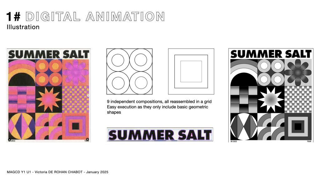
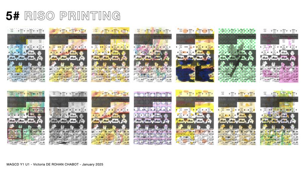
My current practice uses CSM’s risograph leftovers as raw materials for my new animation that will commend riso’s biggest flaws.
*HITO STEYERL ‘In Defense of the Poor Image’ The Wretched of the Screen Berlin:Sternberg Press 2012 pp. 31–45
Creative writing: Final Draft
The first two weeks helped me develop a unique and relevant process to risograph printing. However, the animations themself lacked a bit of context, and were not well communicated. I searched for a narrative that would express the process of riso printing. It would be used as a script, accompanied by illustrative animations.
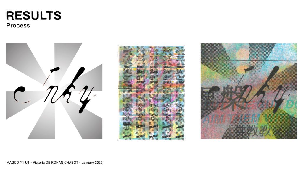
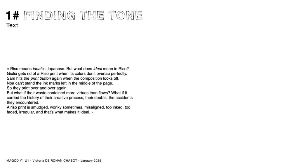
“Riso means ideal in Japanese. But what does ideal mean in Riso?
Giulia gets rid of a Riso print when its colors don’t overlap perfectly.
Sam hits the print button again when the composition looks off.
Noa can’t stand the ink marks left in the middle of the page.
So they print over and over.
But what if their waste contained more virtues than flaws? What if it carried the history of their creative process, their doubts, the accidents they encountered.
A riso print is smudged, wonky sometimes, misaligned, too inked, too faded, irregular, and that’s what makes it ideal.”
Watch the final video to see it taking shape!


Leave a Reply